


INTRODUCTION
When René Descartes asserted as a general rule of his Discourse on the Method (1637) that ‘the things we conceive very clearly and very distinctly are all true’ he was proclaiming one of the articles of the rational faith. Not only that, he was boosting sight as a metonym for thinking itself. Galileo’s The Starry Messenger (1610), a book that revealed for the first time details of craters on the moon, four of Jupiter’s satellites, and many new stars, was also a clarion-call: in the future speculative theories about the universe would have to be tested against the evidence of the eyes — by empirical observation. Almost one-third of Galileo’s book comprises images and diagrams integrated within the text. The modern era was going to be a flat one: of maps and grids and networks. But its workings would be clear. Clarity also determined the three principles of pragmatism, as outlined by the American polymath Charles S Peirce in his famous Popular Science Monthly paper, How to Make Our Ideas Clear (1878).1 Peirce was even more forthright than Descartes:
‘A clear idea is defined as one which is so apprehended that it will be recognized wherever it is met with, and so that no other will be mistaken for it. If it fails of this clearness, it is said to be obscure.’
Between the wars, there was great interest in the issue of clarity, not least because it was felt that a lack of perspicacity about motives had led the European countries into the disaster of 1914–1918. The famous Bauhaus institute in Weimar was set up to clean the Augean stables of pre-war ornamentalism. Sans serif typefaces, including Helvetica and Arial, were championed by the modernists because of their clear, unfussy lines. Ludwig Wittgenstein felt a major source of our inability to understand situations was that ‘we do not command a clear view of the use of words’. For Wittgenstein, the cause of our lack of understanding was grammar itself; and the latter part of his career was an ambitious attempt to correct its parallax effects. The Vienna Circle, with which he was tangentially involved, was on the whole less glum: one of its members Otto Neurath (1892–1945), had the distinction of being the Secretary of the Austrian Association for Housing and Allotments as well as the driving force behind Isotype — a symbolic way of representing quantitative information using easily comprehensible icons. Neurath died as an exile in Oxford, but not before founding the Isotype Institute, which carries on his work.2 Much of the effort to standardise the visual display of statistical information in serious newspapers and journals, to spread the use of pictograms in airports and public places across the globe and even to produce a standard signage for the British motorway system can be traced back to the impetus of Isotype.
TUFTE BELIEVES STATISTICAL PRESENTATION IS A MORAL ACT AS WELL AS AN INTELLECTUAL ACTIVITY
On the other side of the Atlantic, probably the most charismatic and certainly most visible proponent of clarity in the field of information design is Edward R Tufte.3 Born in the war years, Tufte taught at Princeton’s University Woodrow Wilson School in the 1970s as a political scientist, which resulted in a densely technical publication Data Analysis for Politics and Policy (1974), downloadable from his site. The following year, he was asked to prepare a statistics course for a party of visiting journalists. He found the existing literature paltry and ‘grimly devoted to explaining the use of the ruling pen’. The materials he designed for this course, with the participation of the celebrated statistician John Tukey, became the drafts of his first book The Visual Display of Quantitative Information.4 It appeared after he had moved to a new post as professor of political science, computer science, and statistics at Yale University. Unable to find a publisher willing or even able to produce the book to his specifications, Tufte took the bold step of mortgaging his house and becoming a self-publisher: the book as physical object had to reflect the intellectual principles governing its conception.
Thus the Graphics Press got started, only one author on the list. In some ways it was a classic garage operation but, as anyone who has handled one of Tufte’s books will realise, it aims to meet exactingly high design production standards. With the help of a professional book designer Tufte was able to integrate graphics into the text: It was less a revolutionary move then than it might seem (Tufte is keenly aware of how early texts such as Galileo’s were far readier to place word and image together than those of Victorian historians whose snobbery about the prestige of the Word lasted long into the 20th century) but startling enough at the time to ensure the book secured a wide readership. With the success of his following titles, Envisioning Information,5 Visual Explanations,6 and Beautiful Evidence,7 Tufte has become that unlikely thing: a star of the information age. He has even been called — somewhat absurdly — ’the Leonardo da Vinci of data.’ (The New York Times). At his own count, almost 2 million copies of his books are in print, making Tufte one of the most successful self-publishers ever.
A decade after leaving Yale his fame has also been swelled by the popular 1-day seminar ‘Presenting Data and Information’ he has delivered to large audiences since 1993: those who attend his ‘gig’ describe it as the closest scientific presentation gets to revival preaching. At $380 a time it has also made him a rich man. Tuftisms are now to be found in such august organs of the press as the New York Times and Wall Street Journal, although Tufte’s notions of what constitutes a good chart or graph began to influence the way they displayed information decades ago. In recent years, he had even been called up by policymakers to get a grip on the deluge of data flowing out of government departments as they attempt to set up websites providing graphic testimony of their activities. He is quoted by engineers, financial analysts, software constructors, and design students alike.
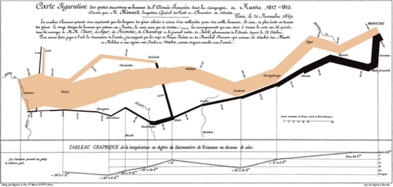
Edward Tufte has reproduced and commented so often on the statistical map of Napoleon’s march on Russia in 1812 it has become associated with his own work. It was prepared in 1869 by the French engineer Charles Joseph Minard. Tufte claims Minard’s map is one of the finest statistical graphics ever made, and one which exemplifies all the fundamental principles of analytical design. Tufte has memorably described this one-page narrative as ‘War and Peace as told by a visual Tolstoy’. Minard’s statistical map shows the successive losses of the French Grande Armée in Napoleon’s Russia campaign of 1812: the broad tan flow-line indicates the size of the army as it crossed into Russia in June, as well as the route taken to the capital. Of the original 422 000 troops, only 100 000 reached Moscow in September, which the Russians had deserted and stripped of supplies. After the largely wooden city went up in flames, the retreat in October is shown in black: the army’s geographical position is linked to the temperature scale and dates displayed on the rule at the bottom of the chart. Reaching in December the Nieman River where it had all started, the army numbered a paltry 10 000. In what is a summary document of slaughter, the attentive reader will also notice the abrupt decline in the width of the black line at another river: that was the occasion of the desperate passage of the partly frozen Berezina when 22 000 men died in 2 days. The chart is statistically and visually virtuous: it shows meaningful comparisons, it provokes thoughts about cause and effect (the plummeting temperature line is eloquent although it says nothing about starvation, desertion, typhus, and suicide) and its six multivariate dimensions are easily distinguishable. Above all, it integrates evidence, showing in one common visual field what many reports consign to an appendix or to segregated tables. Moreover, Minard names himself as author, provides five sources, and proper scales of measurement. He was deeply committed to the substance of his graphic: his map is as much about the pity of war as Wilfred Owen’s poetry.

If he is the secret king of information design, it is largely because he stamped his name on what he prefers to call ‘analytical design’. It is not — pace some of his American admirers — a new intellectual domain: it is part of the general interest in cognitive science that spilled out of the famous post-war Macy Conferences. They provided the theoretical content of early computer design and cybernetics, and even informed such later developments as evidence-based medicine. Tufte is a true child of the information age. His interest in the ‘fit’ between seeing and thinking, and his conviction that design architecture should assist analytical thinking about evidence show that his own thinking still bears the traces of his early training. Undaunted by the increasing scale of the digital universe — it has been calculated that the size of the internet is about 500 exabytes (500.1018 bytes), with a monthly traffic of at least one-tenth that figure — Tufte became the first figure to see that there was common ground between designers making graphics for mass consumption and scientists who wanted to convey their findings through imagery.
Tufte has always advocated parsimony in design and some of his terms (‘Tuftisms’) are typical of his punchy style. ‘Chartjunk’ is his Bauhaus-inspired term of derision for elaborate design schemes that obfuscate, one incriminating factor commonly being a poor ‘data-ink ratio’, where the graphical detail is out of proportion to the amount of information being conveyed. If the thinking task is to understand causality then the design task is — as Wittgenstein might have said — to show causality. A comparative chart calls for a different display set; multivariate analysis yet another. Like Noam Chomsky, whose theory of language posits a universal grammar in which the fixed principle behind all languages is innate, Tufte believes in the universality of certain cognitive tasks: he calls them ‘forever knowledge.’ Its principles are universal, ‘like mathematics, the laws of Nature, the deep structure of language — and are not tied to any language, culture, style, century, sex, or technology of information display.’ Accordingly, he takes pleasure in making his books feel deliberately old-fashioned, with their attention to quality and style: he even feels himself that they have something ‘Japanese’ about them.

Sparklines, which Tufte introduced in Beautiful Evidence, are ‘data words’, small, high-content graphics that allow the reader to follow movement of a parameter over time, with additional contextualisation being provided by a grey band indicating the normal range. A stack of sparklines allows several different variables to be visualised and rapid comparison of their possible significance. Sparklines can be inserted in the line, having been scaled to the same format size as print to take up a horizontal length of only 14 letterspaces. With the new kinds of resolution offered by modern computers (5–100 times that offered by conventional graphics), sparklines can make it possible to assimilate the parallel increased in data produced by modern instrumentation and monitoring systems, and give us some chance ‘to be approximately right rather than exactly wrong.’ 7
This conviction in the truth of perfect communication may have its Utopian aspects — Utopia has always shimmered at the edge of the Enlightenment project — but it makes Tufte a fierce opponent of moral and intellectual relativism. In Beautiful Evidence he embarked on something of a moral campaign against PowerPoint®: ‘I thought that too many PowerPoint presentations were … about power and marketing.’ The cognitive style of PowerPoint is corrupt, he believes; it ‘turns information into a sales pitch.’ It is ‘fiction’ — not a word of praise in Tufte’s vocabulary. Tufte even suggested that PowerPoint was a ‘co-conspirator’ in the space shuttle disaster in 2003 when Columbia burned up as it re-entered the earth’s atmosphere. Following his analysis of NASA’s slides, he concluded that its presentation style prevented engineers from entering results in scientific notation, and that its information density was anyway too low to stimulate effective thought.8 At fault was ‘the PowerPoint design style, which uses about 40% to 60% of the space available on a slide to show unique content, with remaining space devoted to Phluff, bullets, frames, and branding:’ His counterblast against PowerPoint The Cognitive Style of PowerPoint is now available as a stand-alone offprint.9 He is not the only person to regard the widespread use of PowerPoint in American primary schools as another, somewhat more slowly-evolving disaster. Tufte is still a paper enthusiast.
A virtue of a good graphical display is that it allows the viewer to see trends, patterns, or other structures that could have otherwise passed unperceived. We all may have information at our fingertips, but we are also surrounded by ‘non-information’, the unceasing digital doings of what the first professor of sociology at Harvard dubbed, none too approvingly, ‘quantiphrenia.’ The signal-to-noise ratio of our culture has, if anything, tended to boost the noise. Yet Tufte is not perplexed: ‘there is no such thing as information overload,’ he likes to say when he begins his courses, ‘only bad design.’ Clearly there is a huge appetite for what Tufte is offering. His own brainchild sparklines (‘data-intense, design-simple, word-sized graphics’), the principal virtue of which is to show at a glance variation in a single parameter over time, appear in the sports section of the New York Times and on the Yahoo!® financial pages. Words and images interspersed is a prospect that digitalisation has made astoundingly easy: for the old analogue text pictures and illustrations came at a premium. And yet, perhaps the most elementary, slightly paradoxical message which emerges from Tufte’s mission is that computer technology and other modern ‘enhancements’ have little to do with the development of ideas: their flashiness can sometimes inhibit thought.

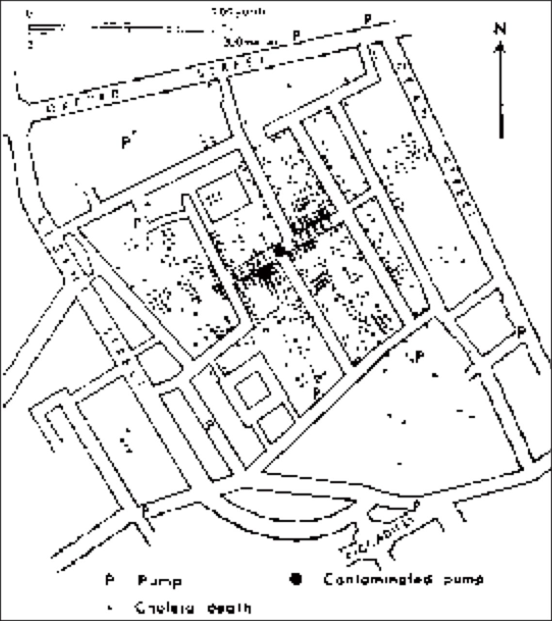
John Snow’s spot map of cholera victims is often said to be the founding script of epidemiology. Once again, in Tufte’s sense, it is a masterpiece of information design which through its clarity of presentation and the commitment of its author still recommends itself to us. In 1854, London, with a population in excess of 2 million, was the largest city on the planet. It was also knee-deep in human excrement, a situation actually worsened by the invention of the water closet which, in the absence of a functioning sewerage system, simply led household effluent into the cesspools maintained in the basement of most urban dwellings. In the cholera epidemic that affected the city in the summer of that year the content of some of these cesspools infiltrated the drinking water supply in Soho. Poor cistern maintenance was partly to blame: the rapid expansion of the city had made it uneconomical to empty cesspools and cart the waste out as fertiliser to the ever more distant farms around the city. Globalization had also played its part: the novel availability of South American guano on the global market made emptying family cesspools (of which there were more than 200 000) even less attractive. John Snow and Henry Whitehead, a local clergyman, spent days walking Soho. Snow mapped the epidemic, house by house, victim by victim, in his search for evidence. The theory of the day was that the miasma that insinuated itself through the streets of London was the source of disease. Snow thought differently, and although he did not understand the actual mechanism of transmission, his hunch that the water supply was to blame, and the meticulous way in which he plotted the results of his survey — with its cluster of deaths near the water pump at 40 Broad Street — led him, deductively, to know what to do. He petitioned the local authorities to remove the pump’s handle. This was done and the number of cholera deaths, already on the decline, further diminished. A decade later Joseph Bazalgette’s sewerage system, although based on a false premise (‘all smell is disease’), proved to be one of the greatest of all Victorian building projects: it is still in use.

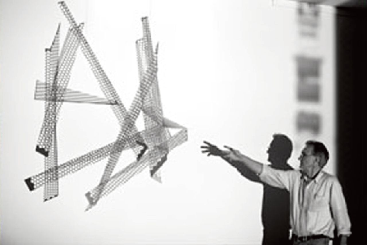
Escaping Flatland 1–10 (1997–2003) by Edward Tufte is a series of 10 stainless-steel sculptures.
Tufte describes his own achievement as an attempt to escape ‘Flatland’, the two-dimensional world of paper and computer screen we are condemned to inhabit insofar as we depend on technological means to represent that world. About the time he began working on Beautiful Evidence, Tufte took up sculpture. Superdimensional site-specific installations made out of porcelain and steel, or even scrap metal, loom over the landscape of Cheshire, Connecticut, in the manner of Richard Serra: the search for fundamentals goes deep in Tufte’s imagination. Not only is ‘Flatland’ the title of a satirical fable by the Victorian writer EA Abbott, it is also the term Thomas Mann reserved for the familiar mundane world from which his hero Hans Castorp is transported to the pure introverted air of the mountain sanatorium in his novel The Magic Mountain. That presumably isn’t the kind of Flatland-escape Edward Tufte is thinking of; nonetheless it is difficult not to detect a certain note of self-satisfaction creeping into his later books. After all, it is only because we are compelled to live in the exotic country of Flatland, with its radical flattening and thinning, that we need specialised geometers like Tufte to tell us what is real and what is only apparent. Balancing purity of expression and the demands of reality, getting them to ‘fit’ has always been a difficult task. For my money, Tufte’s fascinating writing breathes the whole aerodynamic atmosphere of modern technology; his books could only have been possible in the market of ideas that characterised the late 20th century. One wouldn’t want to impugn the belief in universals, but it would seem Tufte perhaps overdoes the timelessness. Information design has a history too.
Acknowledgments
With thanks to Edward Tufte for permission to reproduce the images in this article.
Notes
Provenance
Freely submitted; not externally peer reviewed.
- © British Journal of General Practice 2011
In this issue


Jump to section
More in this TOC Section
Related Articles
Cited By...

